
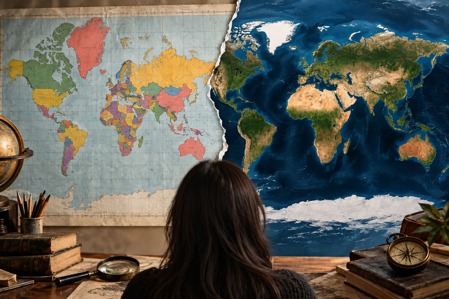
The world map hanging in classrooms, appearing in news graphics and embedded in digital tools can give a misleading impression of the planet. Greenland can look almost as large as Africa. Russia can appear larger than Africa, even though Africa is about 78% larger. And when political borders enter the picture, a map can become more than a geographic diagram: it can become a statement about disputed territory.
That is why the United Nations General Assembly’s September 4 decision to promote more accurate representations of continental size has attracted attention beyond cartography. The resolution, led by Togo and supported by the African Union, passed 164-1, with six abstentions. It does not ban the Mercator projection or legally impose a replacement. Instead, it encourages governments, schools, international organisations and other users to consider equal-area projections when relative size matters.
The distortion begins with a simple problem: Earth is not flat.
Why the familiar World Map makes Greenland look enormous
A globe represents Earth’s curved surface directly. A flat World Map cannot. Cartographers therefore use mathematical projections to transfer the curved surface onto a plane. The catch is that no projection can preserve everything at once. A map may preserve direction while sacrificing area, or preserve area while changing shape or distance. The U.S. Geological Survey says every flat map misrepresents the Earth in some way.
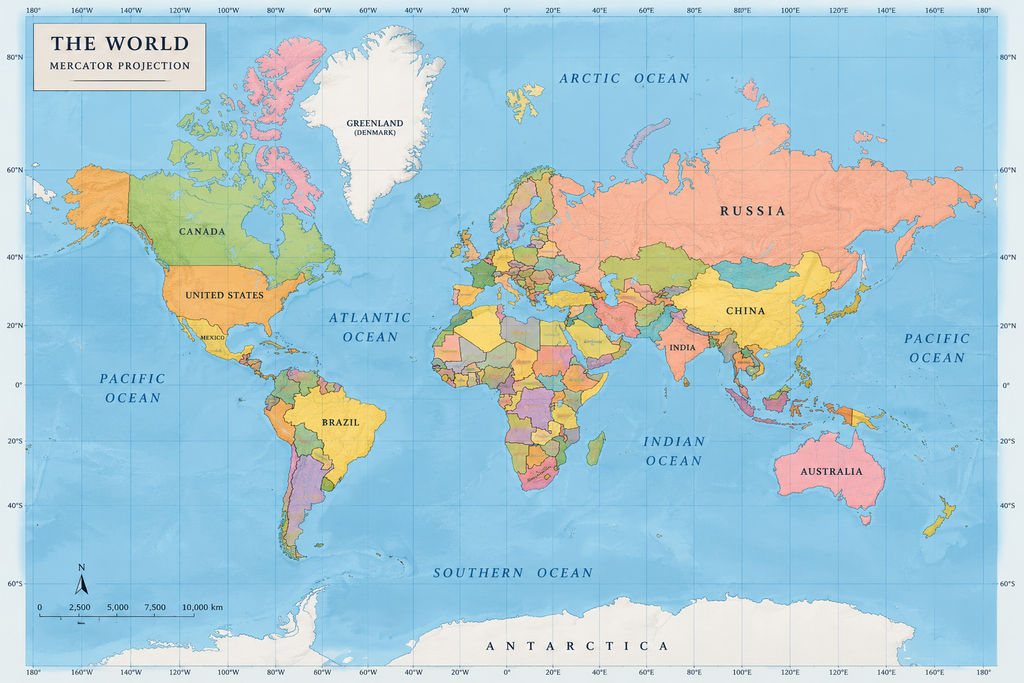
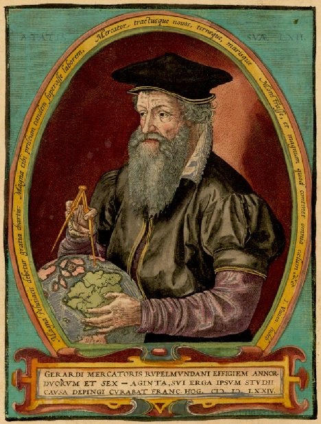
The Mercator projection, created by Flemish cartographer Gerardus Mercator in 1569, was designed for navigation. Its advantage was practical: straight lines on the map could represent constant compass directions, making it useful for sailors plotting courses. But that came with a major trade off. Scale increases toward the poles, so high-latitude regions appear much larger than they really are.
Greenland is the classic example. On a Mercator World Map, the island can look comparable to Africa. In reality, Africa is about 14 times larger. National Geographic notes other distortions: Alaska can appear larger than Brazil even though Brazil is about five times larger.
Russia creates another visual trap. Russia covers about 17.1 million square kilometres, while Africa covers roughly 30.1–30.4 million square kilometres. The continent is therefore about 78% larger. Yet Mercator can make Russia’s northern territory appear overwhelmingly dominant.
The problem is not that Mercator is simply a “bad” map.
Also see: Pakistan Israel War of Words: “Burn in Hell” Amid Lebanon Strikes
Also see: US Army Chief Forced Out Amid War: Pentagon Alarm
Also see: Artemis II Moon Mission: NASA Sends Humans Back After 50 Years
Also see: Hormuz Oil Crisis: Trump Says “Buy US Oil or Take It Yourself”
Also see: I Couldn’t Stay Silent’: UN Diplomat Quits Over Iran Nuclear Claims
The U.S. Geological Survey makes the crucial point: every flat map distorts something. There is no single projection that simultaneously preserves true area, distance, direction and shape across the entire globe. Mercator remains valuable for navigation precisely because it was designed to preserve “a property navigators” need.
The question, then, is what the map is being used for.
Equal Earth tries to fix the size problem
That distinction sits at the heart of the new push. The Equal Earth projection was developed in 2018 by cartographers Bojan Šavrič, Tom Patterson and Bernhard Jenny as an equal-area alternative. It preserves the relative area of landmasses, allowing Africa, South America and other regions to be represented in their correct proportions.
The African Union formally adopted the Equal Earth projection at its February 2026 summit and urged member states to revise curricula accordingly. Togo then took the issue to the United Nations under the “Correct the Map” initiative.
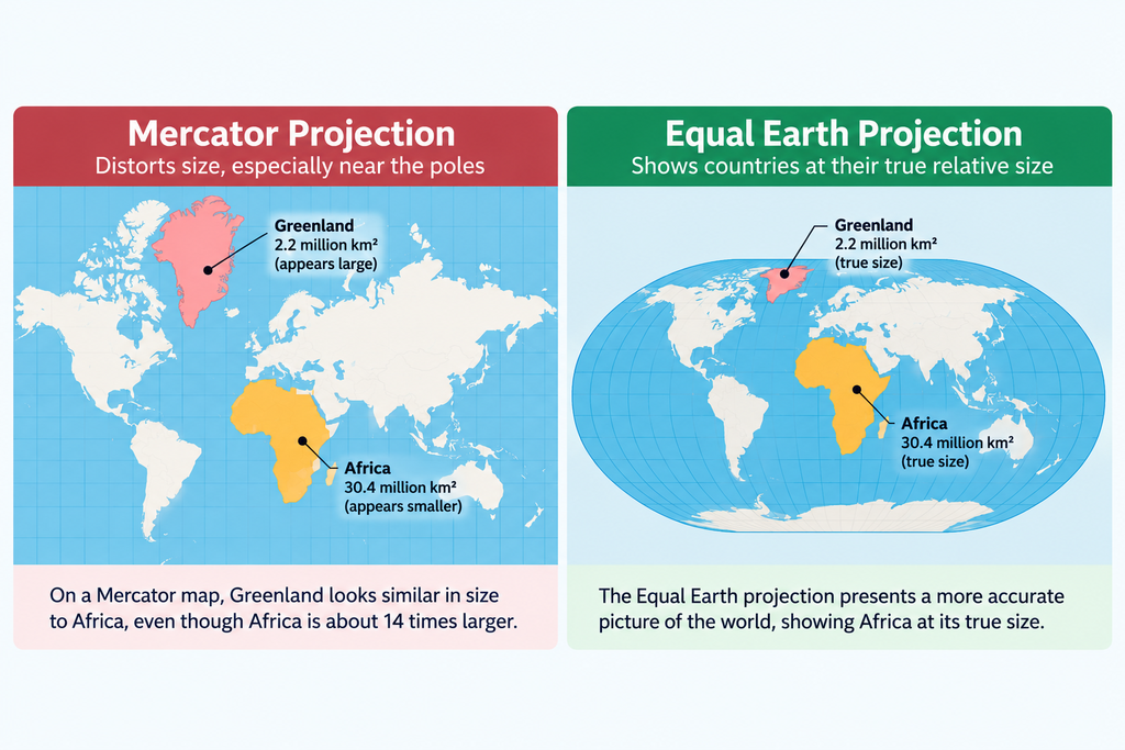
Togo’s argument is partly scientific and partly political. Foreign Minister Robert Dussey said maps “shape our understanding of the world” before the vote. The African initiative argues that generations have been taught a visual geography in which Africa appears smaller than its actual size.
But Equal Earth is not a perfect picture either. Preserving area means other properties must give way. Shapes can be distorted, particularly away from the areas where the projection is optimized. The point is not to create a distortion-free map. No such flat World Map exists. The point is to choose a projection that is more useful when the comparison of landmass size is the priority.
Also see: Jaishankar G7 meeting: India pushes Global South agenda
Also see: Iran Israel War 2026: Oil Surges Amid Hormuz Crisis
Also see: India War Risk Insurance: ₹1,000 Crore Fund Planned Amid Hormuz Crisis Disruptions
Also see: Saudi Arabia Warns Iran Amid Gulf Attacks | Oil Risk
Also see: Can India Broker Peace in the US–Israel–Iran Conflict?
Then the map became political
The UN vote also exposed a second problem: geographic size and political borders are not the same issue.
The resolution explicitly says it does not change sovereignty, territorial status or internationally recognised borders. During the debate, India said it supported the principle of equal-area cartography, not any particular map or projection. India voted in favour of the resolution, while stressing that its position was limited to encouraging equal-area approaches.
Two days later, India’s Ministry of External Affairs spokesperson Randhir Jaiswal objected to representations of Jammu and Kashmir and Ladakh that do not follow India’s official map. India said its sovereign territory must be depicted accordingly.
Pakistan, which also voted for the resolution, took the opposite position on Kashmir. Foreign Ministry spokesperson Sajjad Haider Khan rejected India’s assertions and maintained that Jammu and Kashmir remains a disputed territory.
That does not mean India and Pakistan voted for different geographic principles at the UN. Both supported the resolution’s central cartographic objective. Their dispute concerns how political boundaries are represented, a question the UN resolution deliberately leaves outside its scope. The UN debate itself repeatedly stressed that the resolution does not alter sovereignty or internationally recognised borders.
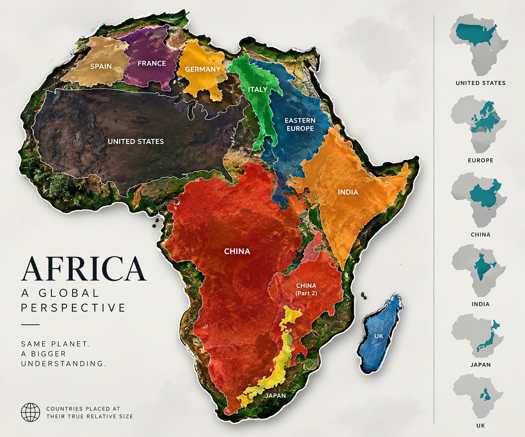
A World Map is never just a picture
The current debate is easy to oversimplify into “the old map is wrong and the new map is right.” The science is more complicated.
Mercator distorts the area, but it was built for a legitimate navigational purpose. Equal Earth gives a more faithful comparison of landmass size, but it cannot eliminate every other form of distortion. Political maps introduce another layer, because borders can be disputed even when the underlying geography is not.
The UN vote therefore does not redraw the planet. It changes the conversation about how the planet should be represented.
Africa was never small. Greenland was never as large as it looked. Russia did not become smaller because another projection exposed its relative size. The geography stayed exactly where it was.
What changed was the frame through which millions of people saw it.
Also see: Sanjay Malhotra RBI Strategy: Powering India’s Economic Comeback
Also see: India’s Forex Reserves Take a hit: What this means for the Economy
Also see: The U.S.-India Trade Pivot: A Grand Deal or a Tug-of-War?
Also see: China’s Trade Balancing Act: Slow Exports, Slumping Imports, and a $170 Billion Question.
Also see: US Job Market Balances Stability and Uncertainty as Government Cuts Bite